
Mia: Silo Busting for users
Skills:
Framer X Prototype
Sketch
Directed Storytelling
Participant Observations
Competitive Analysis
Card Sorting
Kano Analysis
Summary
The Minneapolis Institute of Arts, now known as Mia, asked us to help their visitors use their digital content library. To complete this we interviewed stakeholders, intercepted museum visitors and explored the museum. Our exploration was focused on looking for opportunities to use digital content and deployed technology to help users access the content in context. This research informed our designs as we refined our objectives to align with Mia’s stated design constraints. The primary constraints were:
Focused on in-gallery users
Mobile application’s maintinence costs are prohibitive.
We then decided to build a mobile centered tool using the existing platform and resources available to the museum with the goal of lowering implementation costs and surfacing the most desirable information first.
Final Design Artifact
Problem analysis
Mia categorizes itself as an encyclopedic art museum whose goal is to allow the public to engage with their collection of almost 90,000 pieces in “whatever way they want.” You can access this information on their site, collections.artsmia.org. They have many initiatives designed to give context to their pieces across time, thematic threads and pop culture relevance.
However, 65%* of museum visitors do not know what they would like to explore before they arrive, and wait for something to spark their interest before they decide to dive deeper. Other visitors may want to be guided from the beginning. Finally, gallery experts may come with a particular goal in mind. This is the critical moment for Mia’s enhanced digital content to be easily accessible to its visitors, however they choose to explore the collection.
A gallery expert, and patron of Mia, I encountered photographs and catalogs each gallery in the museum piece by piece, tracking the changes and additions over time on his phone. He does this so that he is able to share his experiences with friends or fellow visitors who engage in conversation with him. This underscores the need for visitors to be able to access the existing information more easily, however they want.
To solve these problems, I partnered with fellow UX designer, Renata Solum. My goals were to find ways to make the existing content more accessible to in-gallery users and to discover new ways of helping people feel close to these untouchable and priceless works of art. Renata’s focus was to uncover ways to help users see themselves reflected in the works and to facilitate conversations around the artworks in Mia’s collection.
*taken from Mia’s 2017 visitor’s survey.
We surveyed Mia’s digital content and how to explore what is available online.
The collections site serves as the primary way to view content of many types related to works in the collection. Optimized for mobile, and fraught with errors in the desktop view, this site offers the most transparency into the different kinds of information related to an artwork and facilitates the kind of exploration the majority of Mia’s visitors indicated they experience.
Our assumption after seeing this was it would be easier to access this valuable content once in the museum and near the artworks.

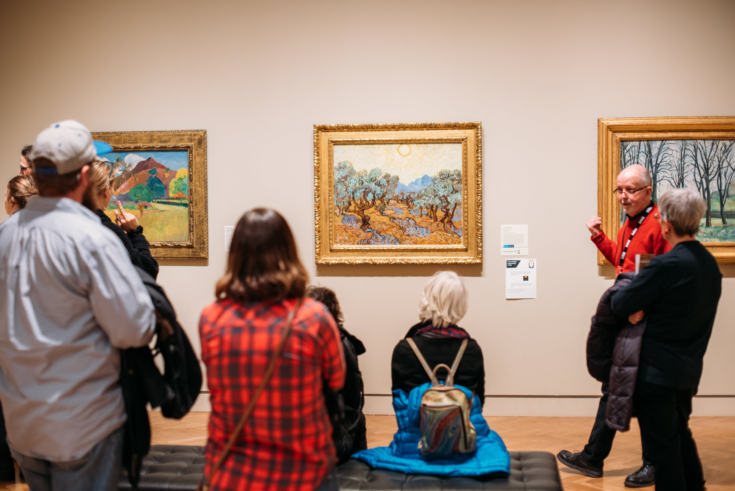
We explored the ways visitors are alerted to digital content within the museum.


Many works in the galleries have additional content which is findable if a user searches by the work’s title, artist name or accession number. Some placards indicate there is additional content online, or use icons to indicate a corresponding audio guide. Any of these searches require that the user knows these tools are available. When asked, most intercepted visitors were unaware of these tools.
Kano Survey

My research partner Renata conducted a Kano survey which collected responses from 23 participants. Her synopsis is below the synthesis graph which distills the responses into four categories, attractive, performance, indifferent, must-have.
“I widened the audience by distributing a Kano survey to anonymous users recruited via LinkedIn and a Slack community. I prototyped 6 feature scenarios illustrating ways in which Mia’s website and in-gallery experiences might intersect…. Three features were at least agreed upon as falling within the Kano domain of “Attractive,” so I moved forward with prototyping a digital experience that included these features.”
Card Sorting
My research partner Renata led participants in a card sorting exercise with museum visitors. The goal was to gain insights about pain points, surface the types of information they expected to see and evaluate the most attractive features from the kano analysis. Her summary of this research follows the images below.
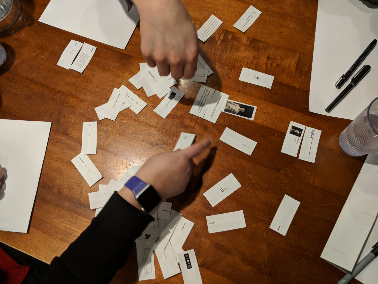
“This exercise delivered three key insights:
Users wished to see detailed commentary for works front and center, to support self-guided exploration in the museum.
They stated that links to museum blog articles and news items were perplexing at best, and seemed like “clickbait” at worst.
They saw the value of indexical information such as accession number, dimensions, and gallery location for a remote or scholarly researcher, but desired to move this out of sight to declutter the experience.
I incorporated these insights into a restructured Object Record to prioritize the in-gallery use case, without compromising remote users.”
Competitive audit of technology


Finally, I explored many possible technologies that could serve visitors contextually relevant content, and at the same time free their time and attention from their devices so that they can take in the artwork and artifacts they came to experience first hand. While Wifi Beacons could best serve every visitor of the museum, this high cost, intrusive installation and upkeep costs directed me to consider NFC as a better option. When combined with existing information architecture and an interactive map NFC’s many caveats become unimportant.
With a clear understanding of our challenge, we formed archetypes for our respective users.

Proposed Solutions

Click this image to see a conceptual prototype of how this information could be mapped into an Augmented Reality view.
Augmented Reality display of content
One idea I explored was to use my expertise in interior photography/360 degree imaging to map Mia’s digital content onto the works present in the gallery. Remote visitors could browse the gallery this way to plan their trip, explore the related works the way that curators have them displayed. This benefit is outside the scope of Mia’s focused user group. On-site Explorers could use this method to explore digital content with ease due to the 1:1 mapping and Community Members could see a visual representation of conversations about the artwork with a comment/contribution heat map. Ultimately the need to update these maps regularly proved to require too much maintinence and the idea was abandoned for others that can be supported by Mia’s development resources.
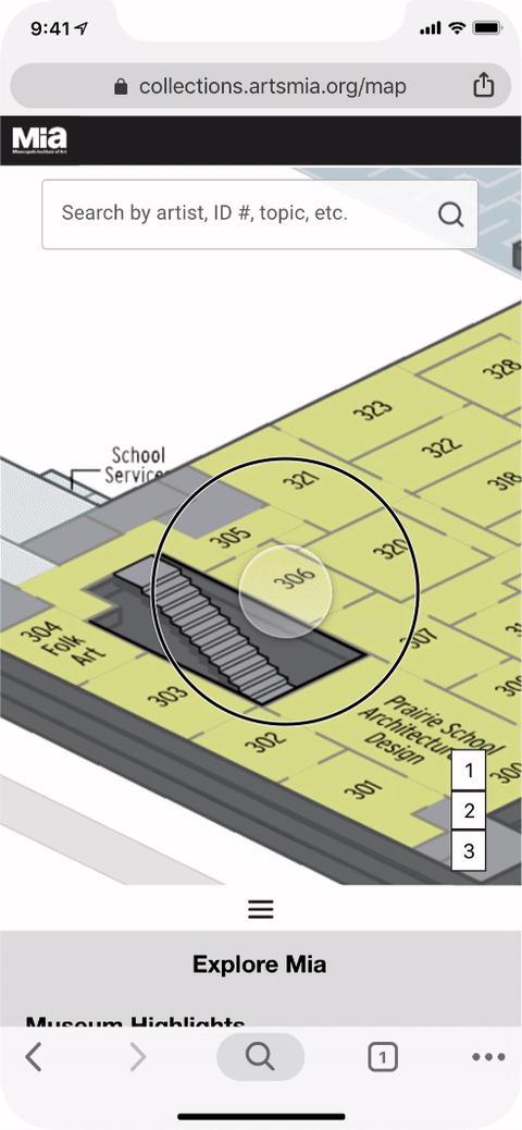
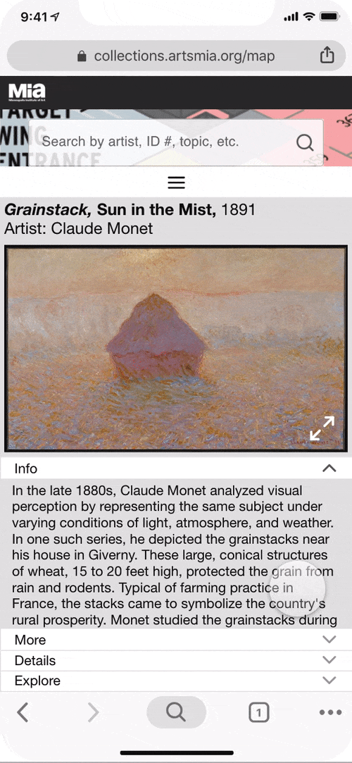
Interactive Map and Object Record
On the collections site is a map of the museum’s galleries which can be searched to reveal which artworks are displayed in any given gallery. Using this existing information, and the knowledge that it is kept up to date as pieces are relocated within Mia’s collection helped us to direct our prototyping to develop an interactive map. Using the map as a starting point visitors will be able wander and discover something that sparks their interest, as well as find something they came to see. The map can also be used to display wayfinding aids for curated journey’s or thematic tours.
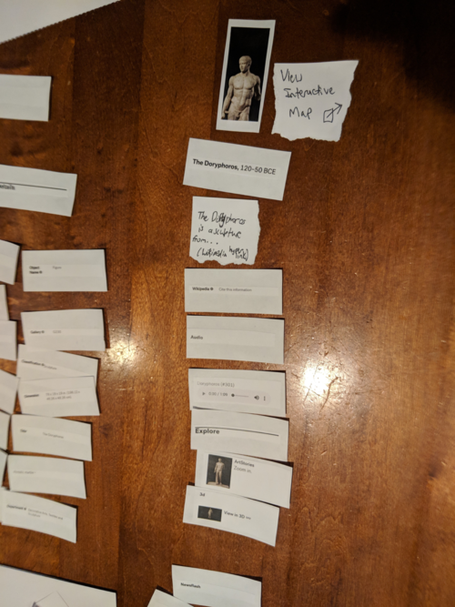
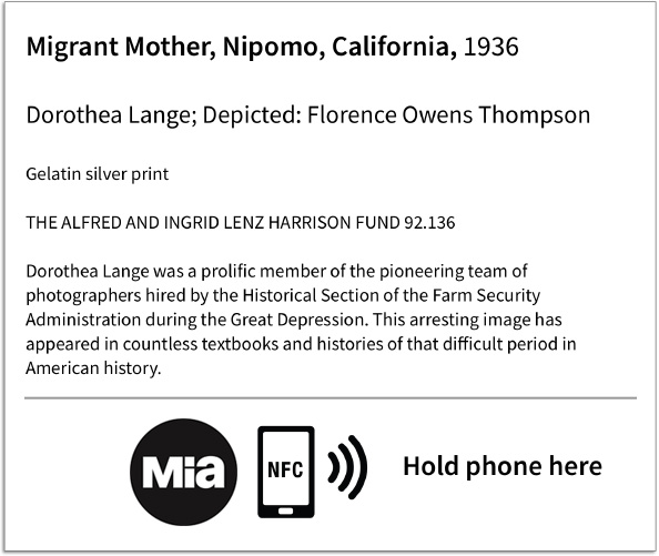
The Object Record was reorganized to display the information found to be most desirable during the card sort activity, and to prototype and provide context to the features determined to be attractive in the Kano analysis.

Click the images above to view full size, one at a time.
Click to download annotated wireframes of the interactive map and object record.
NFC Tags as an accelerator to the interactive map
To supplement the performance of the map to provide relevant information at a glance we used NFC tags in the gallery to allow users to quickly pull up Object Reference cards for a particular piece or to search for all pieces within a selected gallery. This way if a visitor is wandering and they discover something they would like to know more about they do not need to navigate to or search within Mia’s site to find the digital content.
Mia could also place these tags at door thresholds so that visitors could browse the contents of the gallery and have the gallery contents easily at hand, could quickly locate audio guides for any artwork even if it has a crowd of people around it.
Next Steps
Given more time with the project I would like to fully build out the prototype and perform a usability test to evaluate how well the interactive map and object reference work for in-gallery users. I would also like to research what would need to be developed in order to assign artworks a specific wall location within the interactive map. Currently any given artwork is only assigned to a gallery number. Finally, I would like to work with Mia to develop the behind-the-scenes view of particular artworks in Mia’s collection. Visitors often wish they could look at the verso of a painting or the craftsmanship of intricate furniture but cannot due to the priceless and fragile nature of the artworks. Seeing a curator handle, restore or prepare an artwork for display could help visitors feel that much more of a connection to the artworks.